I frequently find myself surprised at the strength of some of my opinions when it comes to the Fox and O’Hare series, starting with one of the prequel short stories—Pros and Cons and going up through 2019’s The Big Kahuna (Book 7). At its best, the series is a great combination of action, comedy, with a dash of will-they-won’t-they flirtatious fun.
As I’ve been reading the latest installment, The Bounty, one thought in the back of my mind is: this doesn’t look like a Fox and O’Hare book. And, like with some of the books, I find myself thinking about this more than than I’d expect to.
Books 1-6
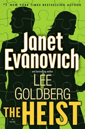
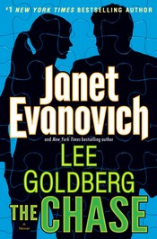
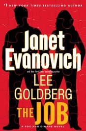
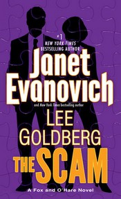
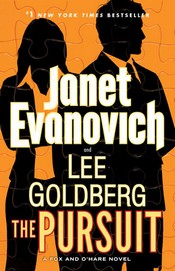

Book 7
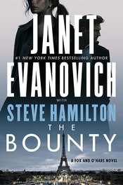
It just doesn’t look right, does it? The other covers (to me) capture the flavor of the books, the bright colors and the silhouettes speak to me of action-comedy. The Bounty looks like a cable/streaming drama. Like, a merger of CB Strike or Jack Ryan thumbnails.
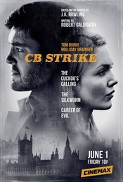
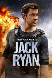
Does it matter that much? That’s a good question—but I’m not sure if I was trying the series with The Bounty that I’d be getting what I expected.
Sure, it might just be a change, and like Garth Algar, I’m not a fan of change. But it’s a branding thing, and why mess with one that’s working?
![]()


Allyson Johnson
I think there was a creativity lapse. They were running through all the neon colors, and the only obvious one left was pink, which perhaps they feared would make the book look like Chick-lit. So they fell back to neutral. Also, its the only over that shows some recognizable features on the protagonists, which is also a big jump. Earlier covers let the reader imagine -always a better option, in my view.
HCNewton
ow wow…the idea of the neon pink cover just hurt my retina 🙂
I’m with you–let us keep imagining them, the recognizable features are a drawback.