
 I started talking last week to Shannon Knight about her writing something for this blog and I was wowed by the cover of her book Grave Cold.
Before I knew what was happening, she’d volunteered to write a guest post about cover design. Longtime readers know that this is one of those things that I can read about any day of the week, so I jumped at the opportunity. Here’s the result. I hope you enjoy.
By the way, click on that cover image for a larger version, so you can see the great details that Knight put into this.
Grave Cold: A Cover Story
by Shannon Knight
Books are first judged by their covers. In trad pub, authors have little to no say in what their covers will look like. For self-pub, it’s a big part of the job. Without the marketing and distribution of the Big Five, a strong cover is paramount. Furthermore, without the genre-specific recognition of a major imprint, the need for genre clarity in a glance is also more important. Therefore, self-pub authors have the freedom of artistic chaos on their covers, but choosing the traditional cover hallmarks of their genre still makes the most marketing sense.
What do cover hallmarks even mean? If you peruse any bookstore, you’ll see patterns amongst cover styles. These patterns denote both genre and target age range. In a glance, readers should be able to see if a novel is middle grade, young adult, or adult. Likewise, they should know if it’s non-fiction, romance, mystery, literary fiction, fantasy, etc. Within fantasy, we’d also like to see if it’s epic fantasy, urban fantasy, steampunk, and so on. For example, fantasy tends to use paintings for some sub-genres and manipulated photos for others. The art style of the paintings change for the different age groups. If you haven’t really noticed before, take a look next time you’re in a book store. Additionally, we should get the mood of the book. Is it dark fantasy? Is it comedic? And, of course, there’s the story. What aspect of the story will we depict to pull prospective readers in?
All we need to do is grab the right readers’ attention. Then the cover copy or opening pages can take the next step.
There are different types of artists and graphic designers that an author can hire to create their covers. Some use stock photos and design software. Authors can look through stock photo libraries for the base images they’d like to incorporate and present those choices to the designers. The graphic designers will work to seamlessly layer images and add special effects. Often, these graphic designers will also offer pre-made covers for sale as a way of showcasing their skills. Otherwise, an author can hire an artist to paint a commissioned piece specifically designed for their book cover. After that painting is complete, a graphic artist can incorporate the typography work that transforms the painting into a book cover. Simple, right?
The rising “AI” debacle has created major waves in the book cover arena. Suddenly, generative AI is swamping stock photo sites and graphic designers’ portfolios. Where did this “new” art come from? The stolen labor of artists, degenerated into an amalgamation of mediocrity. These swindlers have broken the art down into components small enough that they hope no one will be able to say where the original art pieces were lifted from. We’re supposed to happily clap our hands and snatch the resold merchandise. We are even encouraged to claim that we’ve created the art ourselves by feeding the machine suggestions. No one has issued laws yet to try and stop us. Guess what, folks? I write sci-fi. I know a dystopian product when I see one! AI enthusiasts mean to carve away the artist from the art till all we have left is a cheap commodity tech bros can make bank on. Even the name “AI,” “artificial intelligence,” is part of the head trip we’re supposed to buy into so that we can pretend a machine and not a human was the source of the work. AI generative wpriting is the same. No special intelligence is involved. It’s a plagiarism machine built on stolen labor. Nope. Not a chance.
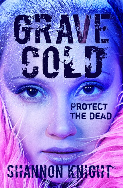
My book Grave Cold, which released in May 2023, is biopunk, a sub-genre of sci-fi that often uses altered photos on the covers. Therefore, I went to Shutterstock to look around. I can’t tell you how many hours over how many weeks I spent exploring the options at Shutterstock. I collected a folder of possibilities. Multiple were from the photographer I eventually chose for my cover. Kiselev Andrey Valerevich shoots dramatic photographs. By purchasing a license to use the photo, I was getting Kiselev’s work, the model’s work, whoever did her hair and make-up—multiple human artists were involved. (Dear world, please note how many artistic minds contribute to a finished artwork and the damage to our artistic ecosystem that the mass theft of AI generative products invites. Please decline that invitation. In fact, set it on fire and howl into the night that you refuse to be party to it.) For this step, I had to consider each photo, what it would reveal or suggest about Grave Cold, and what I could add to it with the typography. My runner-up photos had more of a gothic vibe, and I considered pairing them with typography designed to appear like neon lights. The photo I chose already had the color elements that the neon lights would convey. The part of my story my selected art didn’t show was the death theme within Grave Cold. That’s why I chose to place the tagline, “Protect the dead,” right across the model’s cheekbone. With her violet make-up, one might even wonder if the character depicted was alive. Perfect.
Biopunk tends to use sans serif fonts. I initially tried that—boring!—and then switched to a tombstone type font, feeling clever because of the cemetery connection in the story. I confess my cover looked like a fashion magazine and no one but me saw the tombstone link. Fellow author feedback concurred that the typography was a problem. So I decided to lean into the punk with a distressed font. Boycott by Ryoichi Tsunekawa of Flat-it is the title and author font, while Shortcut by Eduardo Recife of Misprinted Type, a clearer font, is the tagline type. These fonts have so much character! They emanate dystopian distress! I was an absolute fool to consider anything else! But the typography still needed a little something. After inserting half a dozen different options into the font face—frost texture, icicles, biohazard symbols—I settled on one wispy trail of spectral smoke in the V of “Grave,” and a whole column of ghostly swirl up the book spine. Unfortunately, that turned into a headache with the printer, as the printed cover wasn’t showing all of the on-screen art on the spine. Cue multiple color adjustments and reprints because the spine is what everyone sees when the book is shelved. It’s gotta look good!
The back of the book went through several changes. Initially, I’d minimized the pink. Feedback suggested that pink was code romance or YA. (This annoys me tremendously. Pink is so punk!) The back was deep blue, surrounded by frost. However, yet again, the print job did not favor the artwork. I switched to a wraparound of the front picture because a) Kiselev’s photo looks great! and b) pink is punk as hell! I drew DNA strands in a style meant to match the distressed fonts. DNA is a giant biopunk signal. I also added a light glow to the back tagline. Nice! Finally, it was done!
In a self-pub power move, I went back into my text and changed my character’s outfit to match the pink faux fur shown on the front. I knew exactly where in the story I wanted to do it. Just like that, the cover image became an excellent story match.
The Grave Cold cover contains hallmarks of biopunk sci-fi and the artistry to make you stop and stare. I love it! I think it’s a great cover. It’s my story’s job to sell the rest.
Next, I have my covers with commissioned paintings. One is space opera and the other epic fantasy. The artists are still working on them, so I’ll write about those another day, but they should release in June and July. Pretty exciting!
Shannon Knight is a science fiction and fantasy author living in the Pacific Northwest.
Grave Cold is a biopunk novel about the value of life and the power of taking a stand in a grim near-future world of exploitation and authoritarianism.
E-books are available on: Amazon, Apple Books, Barnes & Noble, Google Play, Kobo, Palace Marketplace, Scribd, Smashwords, Thalia, Vivlio.
If physical copies are more your thing: Paperback, Hardcover

allyson johnson
I really enjoyed this post! Lots of good info for when my next novel gets ready for tangible publication!
HCNewton
This was a good one, indeed!