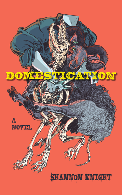
Last year, Shannon Knight and her cover artist stopped by for a Q&A about the cover to Wish Givers and how it was designed. Now she’s back with Savanna Mayer to talk about the cover of her upcoming Domestication and Savanna’s work on the cover. I participated (belatedly) in the Cover Reveal for it last week, but please allow me to remind you all about the creepy image in question.
I typically call these posts “A Few Quick Questions”—but we leave “Few” and “Quick” in the rearview mirror. So I’m going with “Some” (because that’s as creative as I am today). Why don’t we get to them now?
Savanna: Why don’t you give my readers a quick introduction to you and your work–including whatever titles, websites, links, etc. you’re in the mood to share. Also, because I’m a philistine incapable of it–how would you describe your style?
Savanna Mayer is a hermit-like illustrator, collector of rusty old keys, and ever-aspiring necromancer. Residing in the mythical dairyland of Wisconsin, when Savanna is not busy wrangling barn cats, they’re almost certainly drawing lady knights or practicing their Breath of the Wild chefery. With a variety of works ranging from independent comics to sword-themed tattoos, for a wide range of clientele including Critical Role, Baffling magazine, and Dual Wield Studios, Savanna is inspired by all things fantasy. They strive to create new worlds and to explore the power and perspective misfits can bring to them.
I can be found posting the majority of my finished and in-progress work on Tumblr: Nightmaskart.tumblr.com or on Twitter: @well_dipper
My official website is under construction by my lovely girlfriend who handles the confusing computer side of things when I get too overwhelmed.
How to describe my style… let’s see I’d say representational/ old comic book style. I take so much inspiration from Chris Riddel, Tony DiTerlizzi, and Jeremy Bastian. I grew up pursuing a very traditional pen and ink style very akin to the golden age of comics like Jeffrey Catherine Jones and her contemporaries. That traditional base of my work carries over into the way I now work digitally. I do often get asked if my digital works are traditional when in fact I just prefer to use a brush that most closely resembles a pencil to get that nice gritty but at the same time clean line texture.
How did you get into doing cover art? I don’t imagine you just hang your shingle out there (virtual or otherwise) and start getting clients.
I started out doing serious freelance by posting fan art of different TTRPG shows I had been watching and that got attention. I started getting paid to do patreon comics for one TTRPG company and then as my work got more polished indie creators in the TTRPG community reached out wanting to commission me for interior illustration. Finally, I got a gig doing cover work and that just kept going. The TTRPG community has been so nurturing to me as an artist, there’s always work to be found.
Shannon, I had Savanna describe their style earlier, now it’s your turn–how would you describe it? Did you seek them out for Domestication or find them as you were looking for someone and think, “That’s it!”?
I’d describe Savanna’s style as comic with rough lines. I’d decided that a rough comic style would work well for Domestication based on pieces by an artist called WolfSkullJack. (For contrast, I think of Jen Bartel as a comic artist with really clean lines.)
I learned about Savanna in 2023 when I saw an illustration of theirs of Gideon the Ninth, which, of course, was jam-packed with bones. I knew my illustration would need bones, so I took a closer look at their portfolio, which, I admit, was a little difficult to find. In this case, Savanna’s lack of a formal website and portfolio did increase the odds that their commercial work would be less expensive, which was an important element for me, especially since I was passing up the cheaper and more traditional option of altered photography so common in the horror and thriller genres.
Savanna: Any advice for those looking for an artist that Shannon didn’t mention? Obviously, the short answer is hiring you. But let’s pretend you can’t take on a client, what should someone do?
Forgive me for being goth for a hot second, but to quote Hannibal Lecter from Silence of the Lambs, “We covet what we see every day.” I think as artists we’re always voracious to grow our craft and get better and therefore surround ourselves with art that we love and use as inspiration in our own craft. To find artists that create the same work as I do, I would say just look through my twitter feed and see whose work I’m reposting or commenting under, see who I’m following and you’ll find my inspirations or people who match my style pretty closely.
I think it’s perfectly okay to message an artist and give a brief synopsis of your project and be upfront with what kind of budget you’re working with. If it’s not in their scope it’s not rude to ask if they have an artist friend they could recommend for the job with a similar style who’s willing to work for the budget. Most of us in the community are friends and we love to help give each other work.
Yeah, wouldn’t want to sound goth-y with this cover. 
Shannon, let’s focus on Domestication, how (as much as you remember off the top of your head) did you describe what you were looking for to Savanna?
H.C., I pour out words. I am a person of words. With my previous cover artists, I’d had a very specific image in mind, but I didn’t have one for this book. There was one scene I could use, but what I really wanted was an abstract image, so I referenced a few different pictures, I summarized the plot and highlighted some themes, and I even threw in a Spotify playlist of mostly American folk and bluegrass that I’d created for the story while writing.
Elizabeth Peiró, who painted my Wish Givers cover and whom you talked with previously, H.C., really gave me confidence that more is better when an author is first sharing her ideas with a cover artist, which is why I even included the playlist.
I love the idea of a playlist as part of the package. Savanna–did that help? (or at least expose you to new artists?) Incidentally, I’ve been using that playlist a lot since you sent it to me, Shannon.
Savanna: Yes, it was very helpful. I love when clients have mood boards or playlists, it makes it easier to get a sense of what they’re looking for.
Shannon: Oh, hurray!
What was it about this project that appealed to you? (or are you at the stage in your career that “a project that pays” is your criteria?)
Savanna: I may always be at the ‘a project that pays’ criteria stage haha, [I hear that] but Shannon said I’d get to draw bones and I said ‘say less’. I love drawing bones so that was a big selling point. I love horror and I live on a farm already, I know how creepy the intricacy of farm life can get and thought it was a great synopsis for a book so I’m thrilled to work with Shannon. Living on a farm not many people realize how closely you work with the earth and you brush shoulders with life and death every day.
Shannon: Savanna, your work is ideal for horror, and I could definitely see your career expanding in that direction. There’s a simplicity to a comic-style illustration, I think, that allows for frightening and creepy images that would perhaps be considered too much in a more realistic-to-life art style.
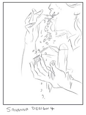
To further make my point, H.C., take a look at one of the alternative designs that Savanna had proposed. It’s very visually arresting! An additional note explained that farm animals, people, and bones are tumbling down from the fingers. Very unsettling and powerful! For additional clarification, my story is entirely realistic in its execution, so these visuals are abstract rather than concrete representations from the book.

For you both: When pitching ideas, do you literally show existing covers by others and say “like this one, but without X” or “something that feels like/has the same vibe as this”? Or do you leave other peoples’ work out of the conversation?
Shannon: This time, I did reference an existing cover. I said I’d prefer something abstract, perhaps with no humans in it at all, and I shared the cover of Kingfisher’s What Moves the Dead with art by Christina Mrozik as an example of an ideal design.
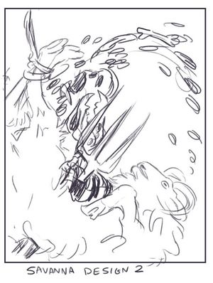
More importantly, though, I tend to share an artist’s own work back with them as examples of what appeals to me. For instance, I mentioned Savanna’s knight and mermaid illustration because of the circular shape of the design. You can see it in one of their proposed designs.

I’m definitely seeing the line between that Mrozik cover and this one.
Savanna: I think when touching base with a client to make sure I’m understanding what they want I try to come up with as many sketches as I can and leave others’ work out of the process as the client will usually have other projects in mind from different media. For this book illustration in the back of my mind, I was thinking of the cover for Lapvona and there’s this sculpture, I can’t remember the name of, but it’s a jackrabbit tied up by its back legs and dangling and I knew I wanted to draw on that inspiration. I don’t want to influence what the client has in mind, because they have a better vision of what they want and I don’t want to skew that vision with other input. I think I only bring up my own ideas from other media if a client and I are really struggling to touch base, but that’s pretty rare.
What was the process involved in designing this cover? Savanna—did you read all/part/none of the book before diving in?
Savanna: Shannon had a strong sense of what she wanted when she approached me. I remember writing down a list of what kind of vibes she was looking for/ what kind of elements/ priorities that must be in the design etc… I wasn’t given access to the full story, but given a blurb which definitely got the vibe across and I got a good understanding of what she wanted. Shannon provided tons of reference photography as well as her own sketches for cover ideas. From there I came up with several sketches, some exact interpretations of Shannon’s original sketches, other ideas that I had come up with based on the list I had made. We settled on a sketch and I did some color passes to determine a palette. After that, I got started on linework and once that was completed I started base colors. I kept Shannon updated throughout the entire process so changes could be made easily if needed. We ended up changing the color palette slightly from red bones back to an off-white color, just to make readability better. After colors, I was all done and handed the files over to Shannon to apply text where it was needed.
Shannon: I would very happily share a book with a cover artist! I learned early on, though, as I queried various artists for my first covers, that asking to read the book was an excessive request of their time, so, with Savanna, it didn’t even occur to me that they might be willing to read it while or before creating the cover art.
(Eli Peiró kindly accepted and read the portions of the book I sent to her for Wish Givers. She was illustrating a scene directly from the book, and she was the soul of courtesy about the extra reading homework. We also discussed any visual deviations from the book.)
Savanna, are there genres that you won’t do/don’t think you can do at this stage of your career? Or are you at an “I’ll do anything” stage? Are there genres that you haven’t done a cover for that you’d like to try?
Hmm, I’m really up for anything, but I know I’m not the best at say the cyberpunk genre, too many sharp lines and mechanical things that won’t look right if they’re slightly off. I love drawing organic shapes too much so I fear cyberpunk may be off the table as cool as it is.
So far, I’ve only done covers for indie authors or indie TTRPG creators. I would really love to do a cover for a YA series that would be so much fun.
I don’t know…I’d like to see you tackle “Johnny Mnemonic” or some other early-Gibson work…I can see it. But I hear ya…probably not your direction.
I’ll be honest, I’ve never heard of “Johnny Mnemonic”, apologies. I’m more of a horror or fantasy fan and rarely venture into the world of sci-fi.
It’s an early cyberpunk story, no big deal.
Shannon: The Locked Tomb is sci-fi! I also wrote a necromancer sci-fi you might be game for. It’s set in the near future, with a necromancer beautician and a man born in Anglo-Saxon England working together to save the dead from being used as an energy source. It’s called Grave Cold.
Another one for both of you: Are there examples of cover art/design recently that have made you stop and say–“I’d love to try something like that one day”?
Shannon: Oh! I just saw a special edition book cover by Danlin Zhang that took my breath away! I especially adore this type of romantic cover with a lot of botanical details and a protagonist. No shock that Danlin is also the artist behind the special edition of Fathomfolk. I super like those soft colors and expansive details. I’d love to write a fantasy that would go with these types of covers.
Savanna: Oh where to begin… J.H Williams has been working on this comic book series called Echolands and everything is in landscape orientation. Not only does this make for incredible covers, but inside are sprawling comic pages of someone just running through an unending crowd.
Don’t Go Without Me by Rosemary Valero-O’Connell, the cover is a limited color palette of purple and pink, with the main figure entirely in shadow looking out into a window of pink chaos and there’s gold foil emerging out of the pink chaotic figures.
My friends Cait May and Trevor Bream have their graphic novel out called Another Kind, the cover illustration is incredible and I got to see all the sketches before the final product, but my favorite part of the hard jacket copy is taking off the dust jacket and on the book cover are eerie green cabinet of curiosity bones of different creatures in the book and ugh I want to do something like where the cover and inside cover play off of each other so nicely.
Finally, anything by Jody A Lee. Her covers for Mercedes Lackey’s books are something I always go back to, the way she uses color and texture, I just stare at her work for hours and I love when she does little vignettes of other characters in the borders, I try to do the same in my own work.
Shannon: I had so many of those Jody A. Lee covers as a kid! I love those! The way the whole design of the illustration works, especially breaking off from the primary illustration of the protagonist, functions so perfectly as a cover design!
I appreciate the time that that Shannon and Savanna took for this. Readers, be sure to check out Shannon’s site for more about the novel, Domestication and go spend some time looking through Savanna’s portfolio. You’ll be glad you did.


2 Pingbacks